you are looking at the communication / presentation blog of group 26 for the course Visual Communication Design

to see or not to see


Tuesday, June 22, 2010

final version

Museum route
 
Shopping route
 
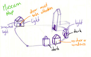
Here they are! The final versions of the two maps. These are the final maps we made using the insights from the user test in Rotterdam.
 
Things we have changed are:
  • added more streets and buildings (grey surfaces) at the left bottom. In the previous version (see below) the museum route was  very unattractive, because it looked like you would walk just outside of the center. While when you would take the shopping route, you would go inside the center and see water and little streets which makes it much more appealing.
  • broadened the canal along the Phoenixstraat. We did this for the same reason as above, to make this side more appealing.
  • the starting point is pointing up now, instead of to the right. Of course, pointing to the right gives the map too much of a direction.
  • removed the gradient over the map and houses. The map and houses were provided with a subtle gradient to enhance the feeling of perspective. This caused more problems than it solved however, so we removed it.
  • changed the color of the route to a more contrasting color.
  • the Phoenixstreet was dark grey, we changed this to very light grey. We wanted to make both sides as equal as possible, but in the previous version, there is this dark grey stroke along the museum direction. We thought this had a negative effect for this direction.


Monday, June 21, 2010

making of... the icons

First we start off with the base shape. This is exactly the same for both to create a balance between them.

Then we modeled the characteristic rooftops.

The ribbon and the big M are the main clues as to what the icons depict.

Some extra detailing in the facade.

And finally, the shop sign and the flag to finish it off!

Sunday, June 20, 2010

results user test

When we showed both maps, 19 of the 20 people saw a difference. Most of the comments were on the difference in direction of the icons/buildings. Some people said that the locations of the buildings were different and some thought the colors were different. Surprisingly, some people saw only difference in one group of icons, like ' the ribbons are turned'.

8 people were shown the shopping route. 7 of the 8 people did choose the shopping direction. Since almost all the participants chose the direction we wanted for the shopping route, we did not find it necessary to ask more people.

12 people were shown the museum route. 6 of the 12 participants chose the museum route. This shows that this map was not very effective. We could not influence their decision.

If we compare this element to the fact that almost all participants looking at the shopping route took the right turn, we can say that we have to minimize the elements on the museum route, which make the viewer miss our point and choose the wrong direction.

We did not find any significant influence on the choices of the participants depending on the way we asked the question, like explained in the previous post.

The table below summarizes the results of the test.

user test in Rotterdam

On saturday we tested the maps in Rotterdam. We tested 20 people who were not familiar with Delft. We also made a division in how we asked the question to the participants. So when testing the museum map, we asked one half of the participants 'you want to visit museums and shops, which route would you choose?', and one half 'you want to visit shops and museums, which route would you choose?'. The results of the test will be posted soon!


take a closer look

Here are the new icons one more time, but this time closer. We are very proud of them :)


Friday, June 18, 2010

the 3d icons placed on the map


We introduce the new 3d icons of shops and museums in this version of the map. The direction of the facades in relation to the route, the cast shadow of the icons on the ground and the gradience of color complement each other in pointing direction.

Thursday, June 17, 2010

position and direction of icons

We decided on the directions of the front sides of the icons, which will be the main difference in both maps. Below both maps are shown. However, on the museum route map we want to make adjustment on the directions of the green icons. They have to turn to the left a little more, to emphasize the direction a little more.

Shopping map with the correct directions.


Museum map, where the green icons need some adjustment.

museum icon

For the museum icon, we came up with a new roof which resembles the army museum (Legermuseum) in Delft. To make this icon more interesting and balanced with the shop icon with the ribbon on top, we added a big M on the roof.

This is the rough icon sketch.

These are some ideas, but the middle M is the final one which we put on the roof.

In a new post, coming soon, we will post a preview of the icons!

Tuesday, June 15, 2010

trying out light effects and shadow

Next to the icon design, we are looking at the effect of light and shadow. Since we want to show the direction of the route by using the facade directions of the buildings and with light, we experimented with light. Below you can see this experiment.

The conclusion of this experiment is that the using only shadow is too subtile for showing a direction. It has to be done in combination with light and dark faces of the icons and the direction of the facades.


defining the position and amount of the icons

Next to the icons, we are thinking about the amount and position of the icons on the map. We used a map of Delft to define the amount and position of the museums. According to the amount of museums, we used the same amount of shopping icons. We tried to keep the balance between the icons. This is the result. The pink dots indicate the museum, and the green dots indicate the shops.


more icon design

We have designed museum and shopping icons, which we will use on our maps. We had a lot of brainstorms about how the icons should look like and we decided that both museum and shopping icons should be buildings. This makes is possible to work with the front and back sides of the icons.

Next to that we want to have cartoony icons to give the map a certain character and style. These are the icons for now.


The museum icon has the traditional triangular shaped windows of old Dutch houses.


The shopping icon has a ribbon around it, to emphasize the meaning. It also has the traditional facade of old Dutch houses.

We are making some adjustments to these icons and the final version is almost finished!

suggestions for the shop & museum icon


The icons have been arranged in different angles indicating the clockwise direction. A mirrored image of the icons will be used to direct the viewer counter clockwisely.

Friday, June 11, 2010

balancing the map

We decided to change the orientation of the map to see the effect. We figured this would be more fair for both directions, since in the previous version the shopping route was more inviting bacause of its straight line to the top.

Now we have the starting point in the middle, and both directions are showed in the same angle to the viewers.

how to direct the light

We are thinking about the positioning of the icons and also about the direction of the light. In the pictures below you can see the two maps, where we show our thoughts about light.


Tuesday, June 8, 2010

working...

We needed some fuel while working on our maps. And Thian really enjoyed the swedish fuel :P

Sunday, June 6, 2010

icon ideas


Don't mind the doodles :P

Here are some ideas I made for the museum and shop icons. The icons marked with the circles are the better ones.

Friday, June 4, 2010

which way would you go?


Perspective and the angle of the facade are the key elements used in these posters to invite people take one direction.

A. We can use perspective in 3d icons to influence perception of what is close.
  • Because, when something is close, you are (almost) there.
  • And also because, perspective can indicate direction.
In order to indicate a circular direction, we cannot be consistent in use of perspective in all icons.

The icons that are at the end of the route ( and also close to the station)
should not be perspective.

This inconsistency can be less obvious when the icon is not very realistic. Cartoonish icons can be recognisable even with distorted perspective.

B. At the same time, we use the facade of the shop & museum icons to invite people take one direction, and not another.
We would like to test the influence of the angled facades.
We suppose that when the facade is placed vertically to the route, it's more inviting than when it's parallel to the route.

Thursday, June 3, 2010

assignment 2 - tutor meeting

Last week, we had a meeting with the tutor. These are the conclusions from that meeting.

Looking at the concepts on the blog, icons have to be more equal:

  • red color (of shopping bags) is much more strong than the blue (museums) - colors of icons has to be the same strength (maybe different saturation to emphasize one direction)
  • the size should be also equal - now bags are much bigger than museums. if we want to show that in a certain area there are a lot of shops, then we increase the number of bags but not the size.
  • icons have to have the same contrast - now the white lines around the icons have big contrast against the dark shading of the bags - contrast is much less with museums (maybe skip the white line around)
  • play with light - the light is falling on the side that tourist should be facing. But even in this case light effect on both types of icons should be equal.
  • shape of the icons should be the same - now bags are shorter on one side and broader on the other, while museum is "square", maybe museum should also be shorter on one side.

So from this what we need to do:

redo the map with streets:
  • make it more abstract, simplify it
  • tilt it (a bit 3D effect)
redo icons:
  • design of the museum icon and shop icon: shape? temple and shopping bag? doors? based on the real buildings?
  • placement of them: how big should the perspective angle be, the same angle for all the icons? or turn them depending on the route?
  • play with light and shadow

Saturday, May 29, 2010

assignment 2 - buildings on a map

We found some maps with buildings which are inspiring for us. Since we want to leave the shopping bags out and use buildings for both the museums and the shops, we are looking at other maps for inspiration. These maps are not particularly showing a direction. But they are interesting to see, because of their different styles, light directions and orientation to the viewer and the road.


Friday, May 28, 2010

assignment 2 - inspiration


When searching for inspirational pictures for a museum icon, we found this picture. It shows a very nice way to illustrate a bar. The style is funny and the light indicates a direction and invites you to come in.

Thursday, May 27, 2010

Sunday, May 23, 2010

assignment 2 - concepts

Here are our two concepts for the Delft Museum and Shops map. It is based on concept 8 where the doors of the houses face the path. The idea is that the route which is suggested, has all the icons facing the walking direction of this route.

So in concept A, the museum route is suggested and the museum icons are more or less facing towards the traveller walking along that route. The shopping bags are seen from the side which is less inviting than the museum icons.

In concept B, the shopping route is suggested by turning the shopping bags towards the route. The museums are standing with their backs to the viewer. This hopefully makes the shopping route more inviting than the museum route.


Concept A


Concept B